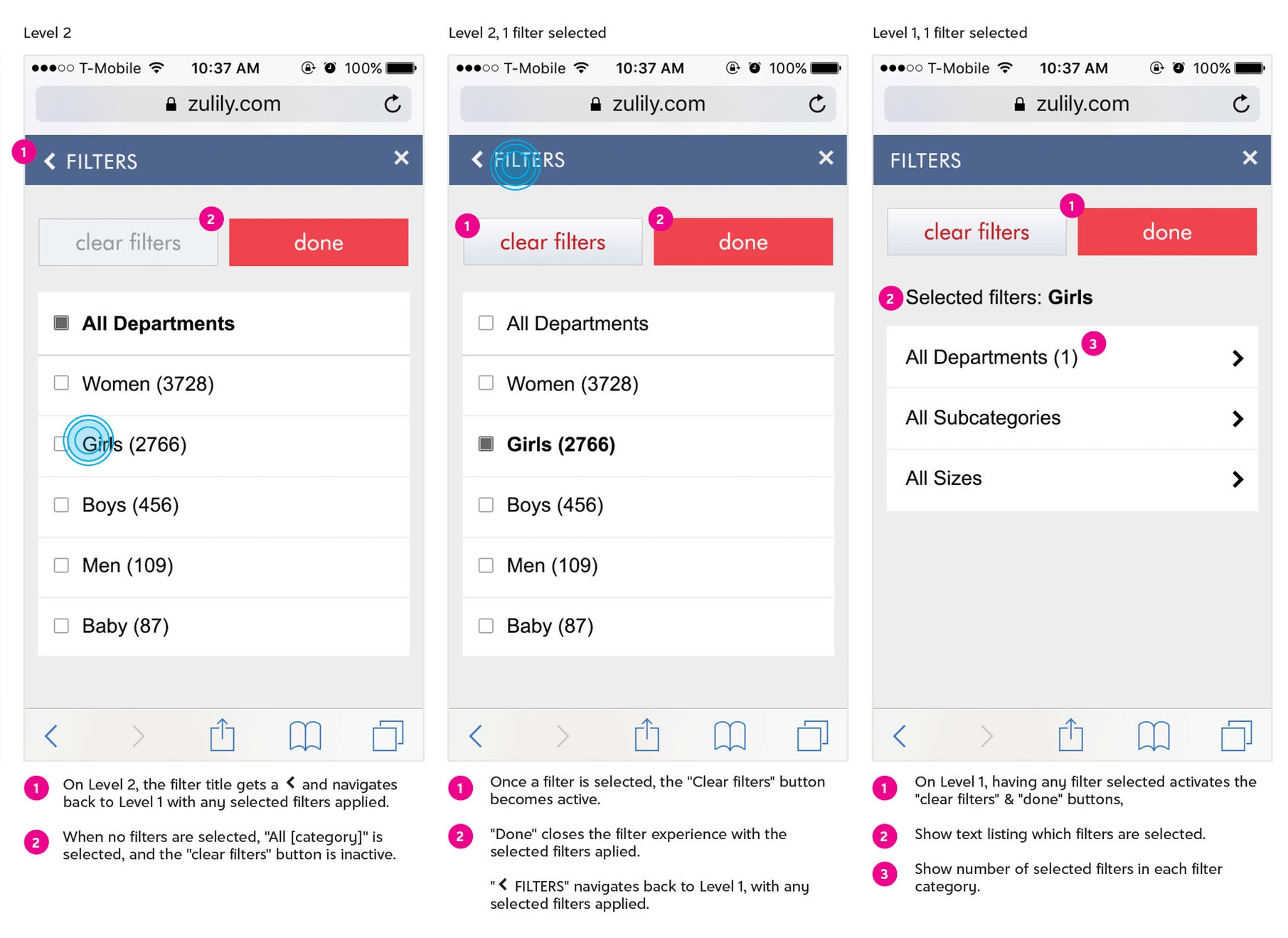
Mobile filters
A new zulily.com search results page that allowed for multiple filters (size, price, category, etc), tested positively with desktop users. On mobile, however, the method of stacking multiple filter buttons vertically was clunky, awkward, and pushed the page content too far below the fold. While users preferred multiple filters on desktop, internal testing showed once they were on their mobile devices, engagement and overall demand dropped significantly.
Usability studies have shown clear, well-defined navigation is more important than minimizing the number of clicks. By breaking the filter experience out across multiple screens of navigation I was able to simplify the page and keep the user focus on the task at hand.
Interactive prototype